set.seed(1234)
df <- data.frame(
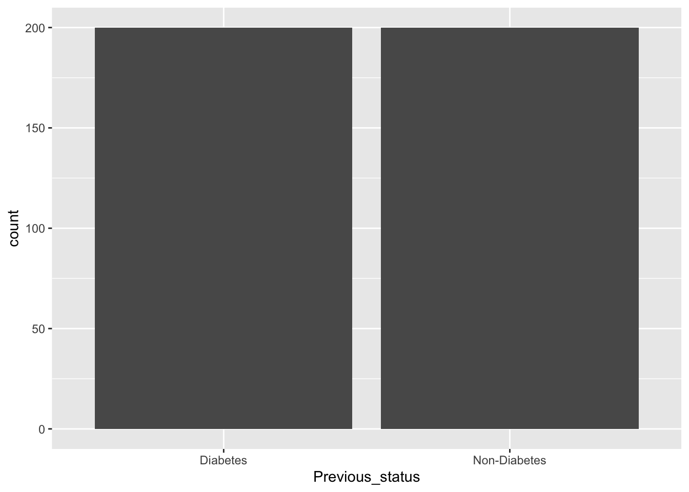
Previous_status=factor(rep(c("Diabetes", "Non-Diabetes"), each=200)),
FBS=round(c(rnorm(200, mean=160, sd=20),
rnorm(200, mean=100, sd=20))),
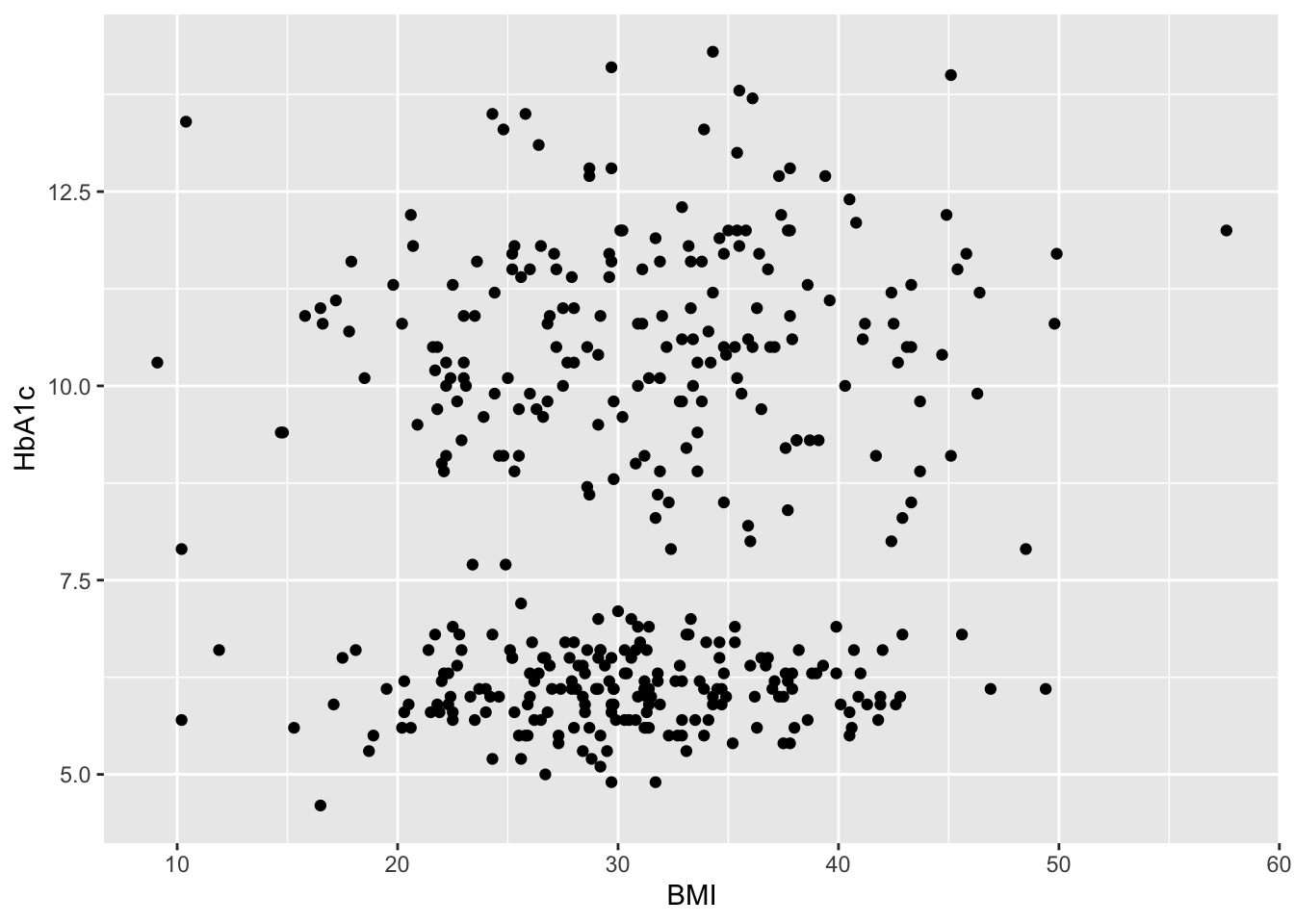
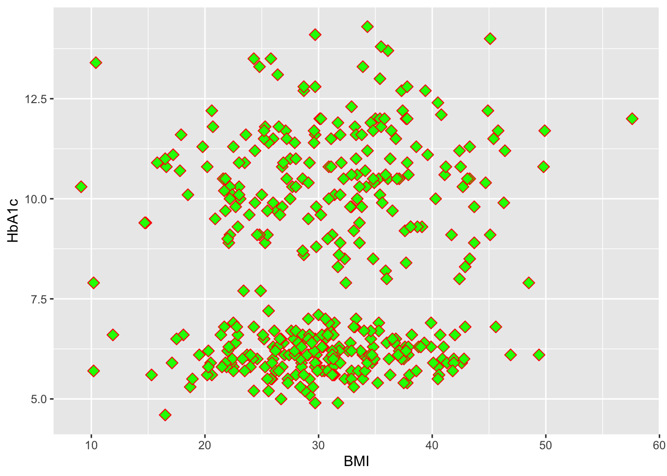
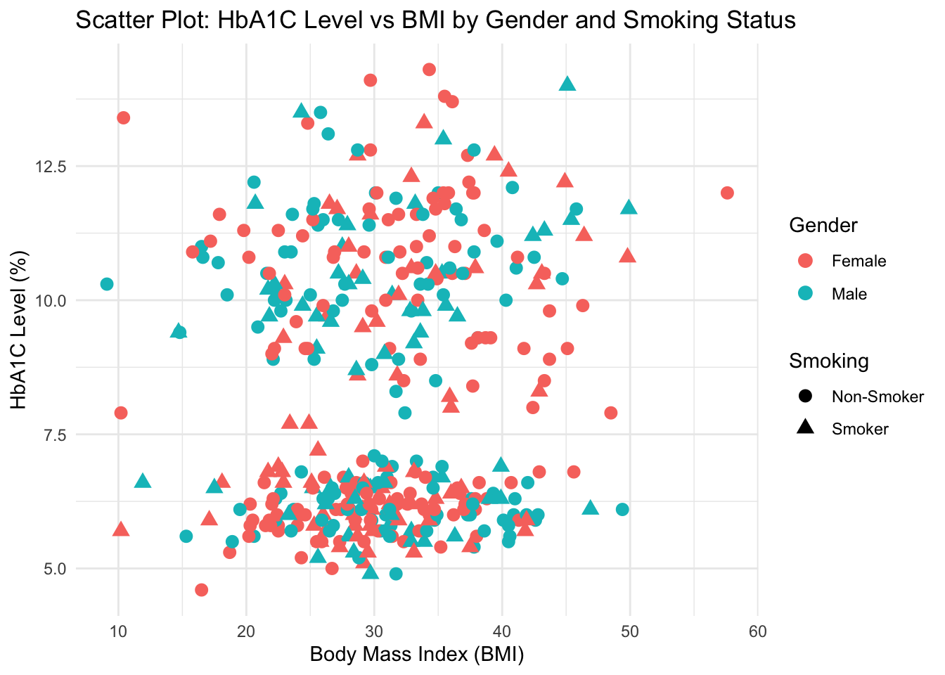
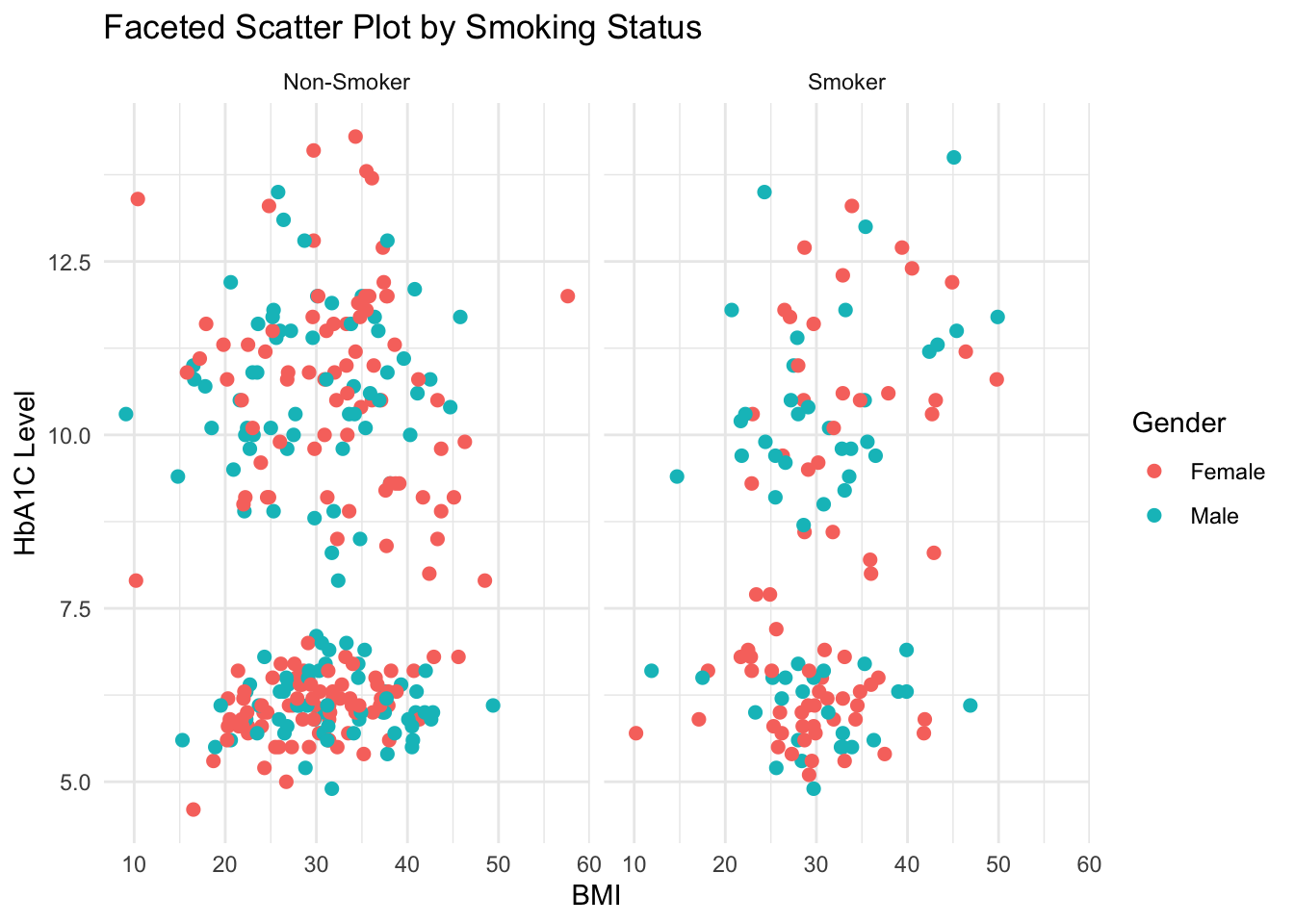
BMI=round(c(rnorm(200,mean=32,sd=8),
rnorm(200,mean=30.5,sd=7)),1),
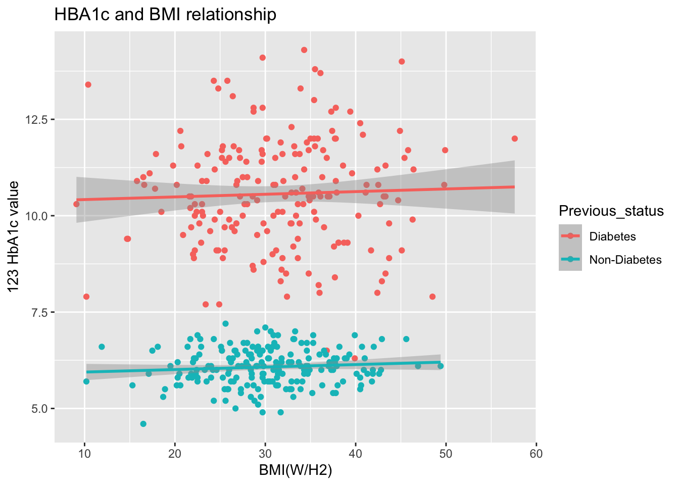
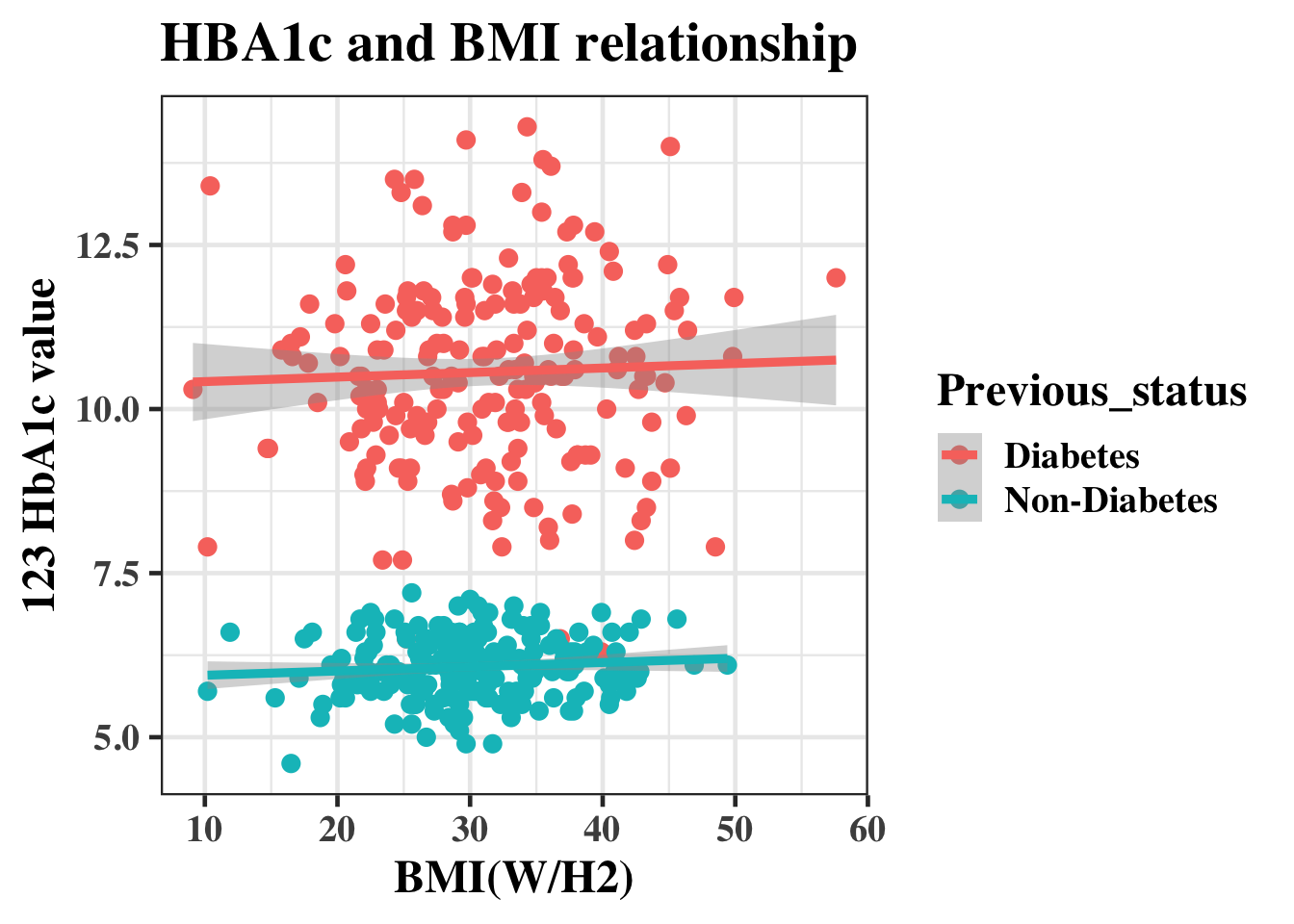
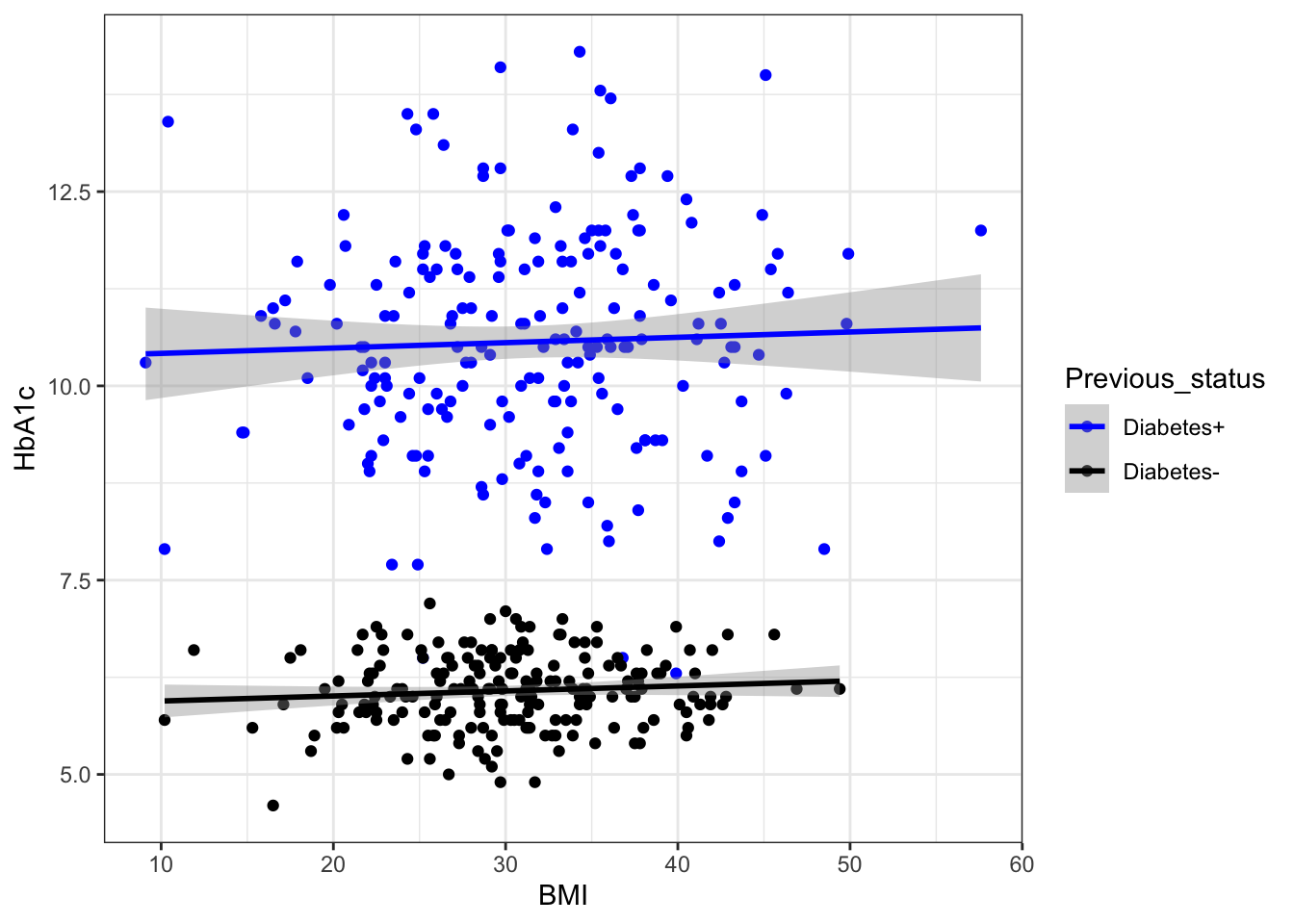
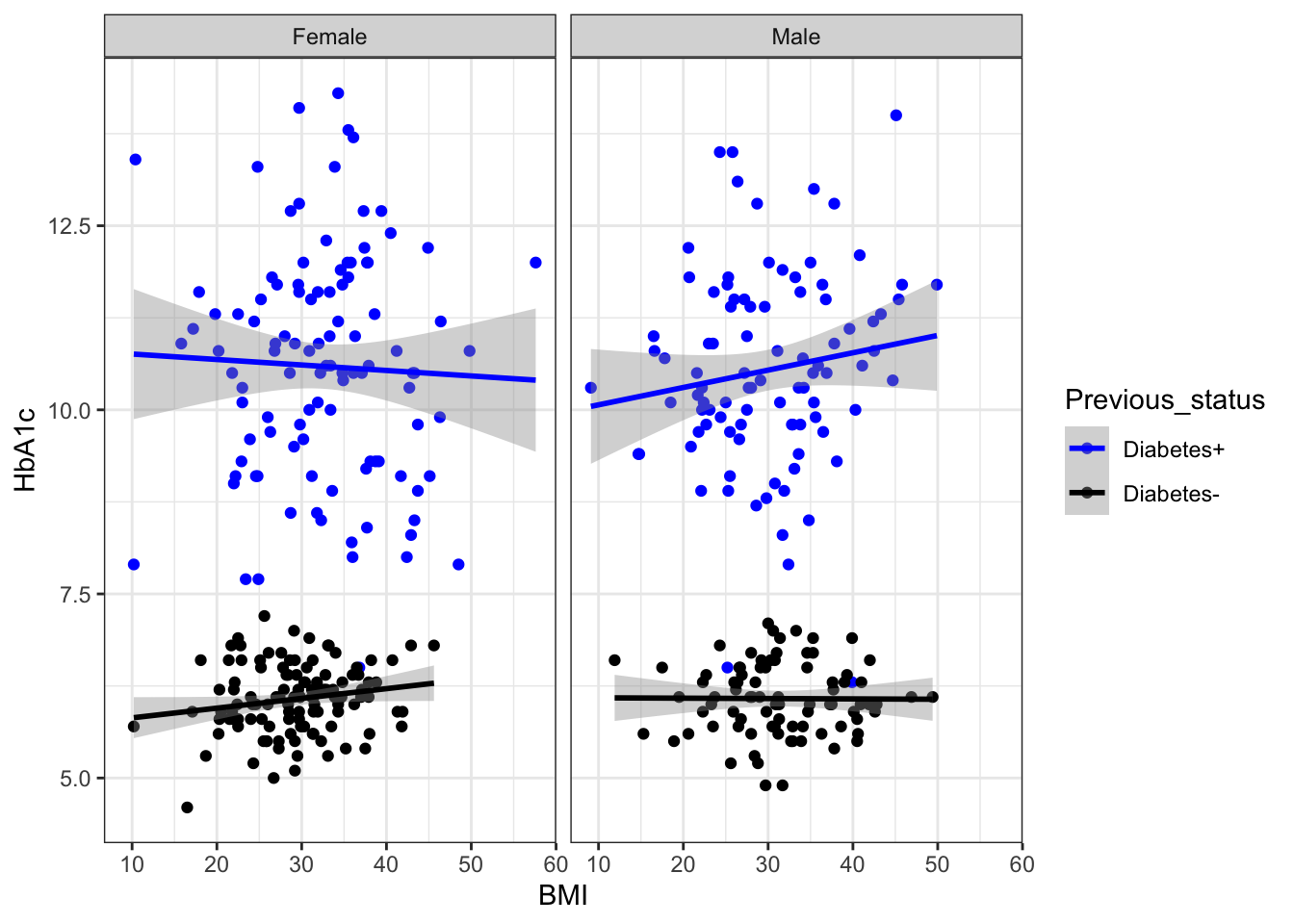
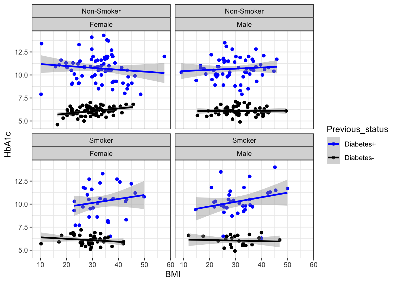
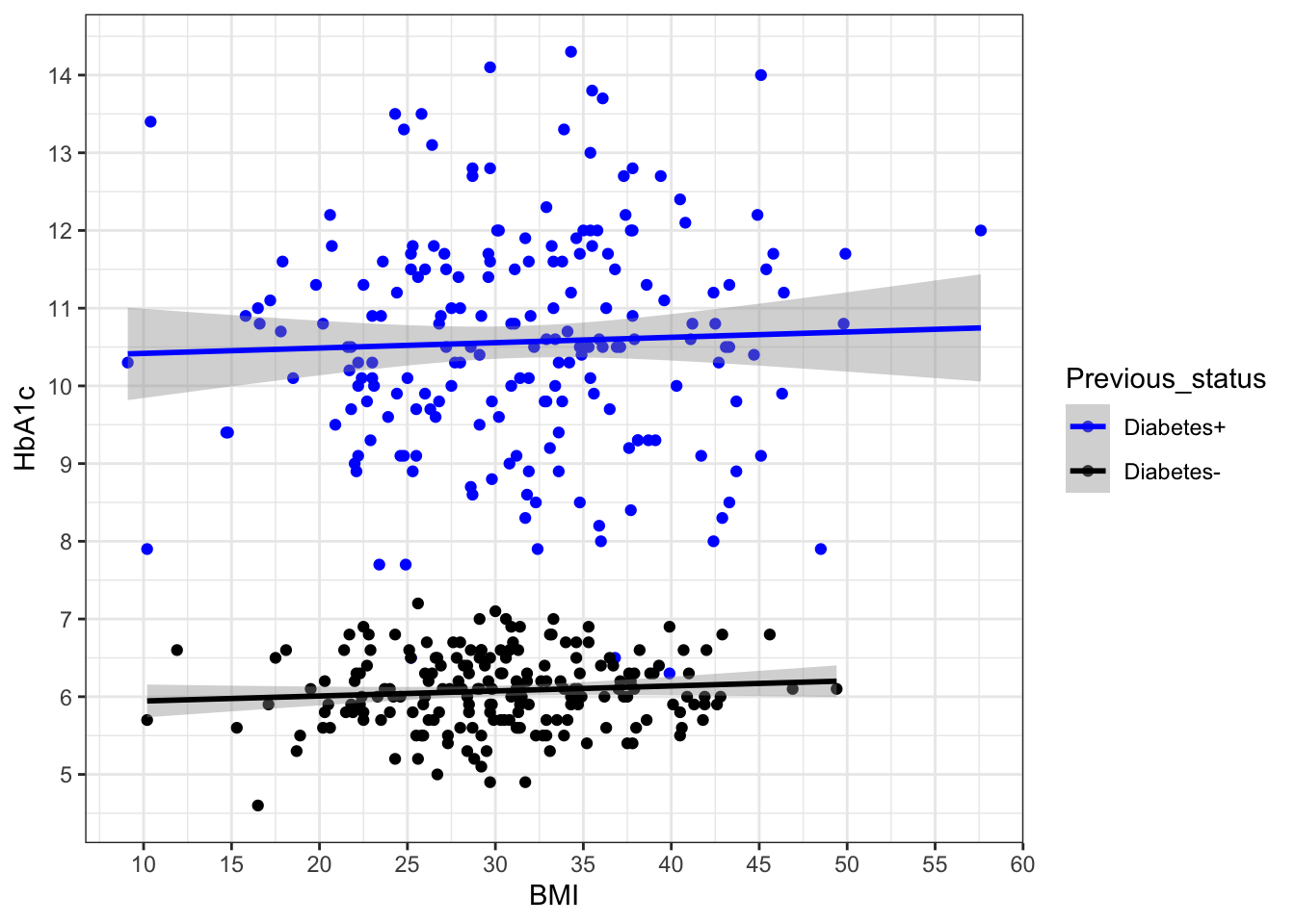
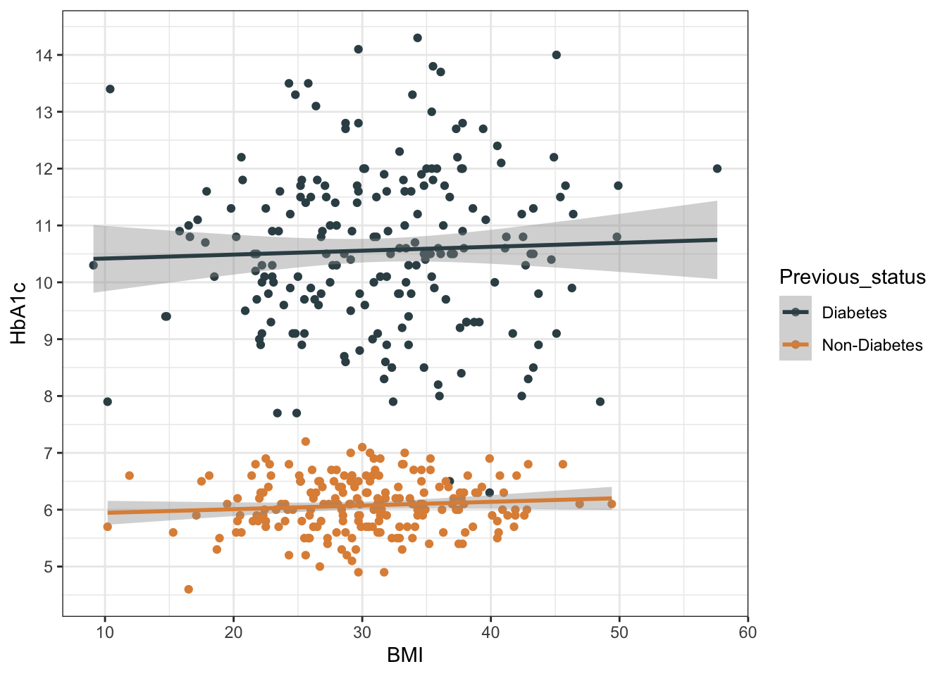
HbA1c=round(c(rnorm(200, mean=10.60, sd=1.5),
rnorm(200, mean=6.1, sd=0.5)) ,1),
Smoking=rbinom(n=400,size=1,prob=0.30),
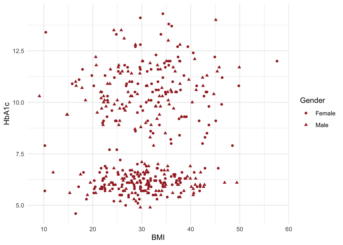
Gender=rbinom(n=400,size = 1,prob=0.45)
)
df$Gender<-as.factor(df$Gender)
levels(df$Gender)<-c("Female","Male")
df$Smoking<-as.factor(df$Smoking)
levels(df$Smoking)<-c("Non-Smoker","Smoker")
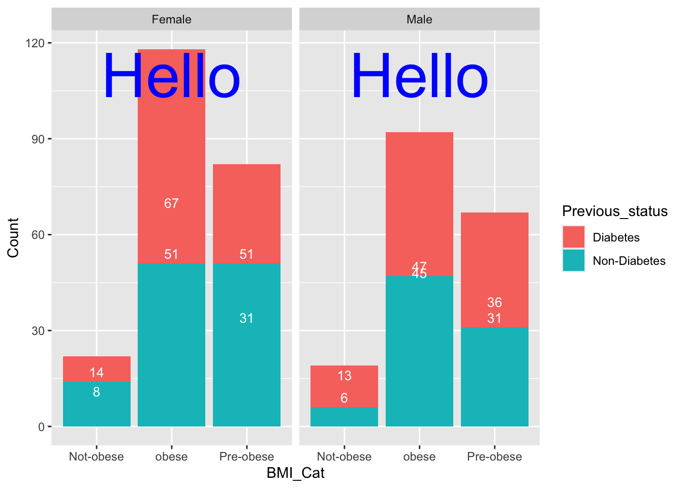
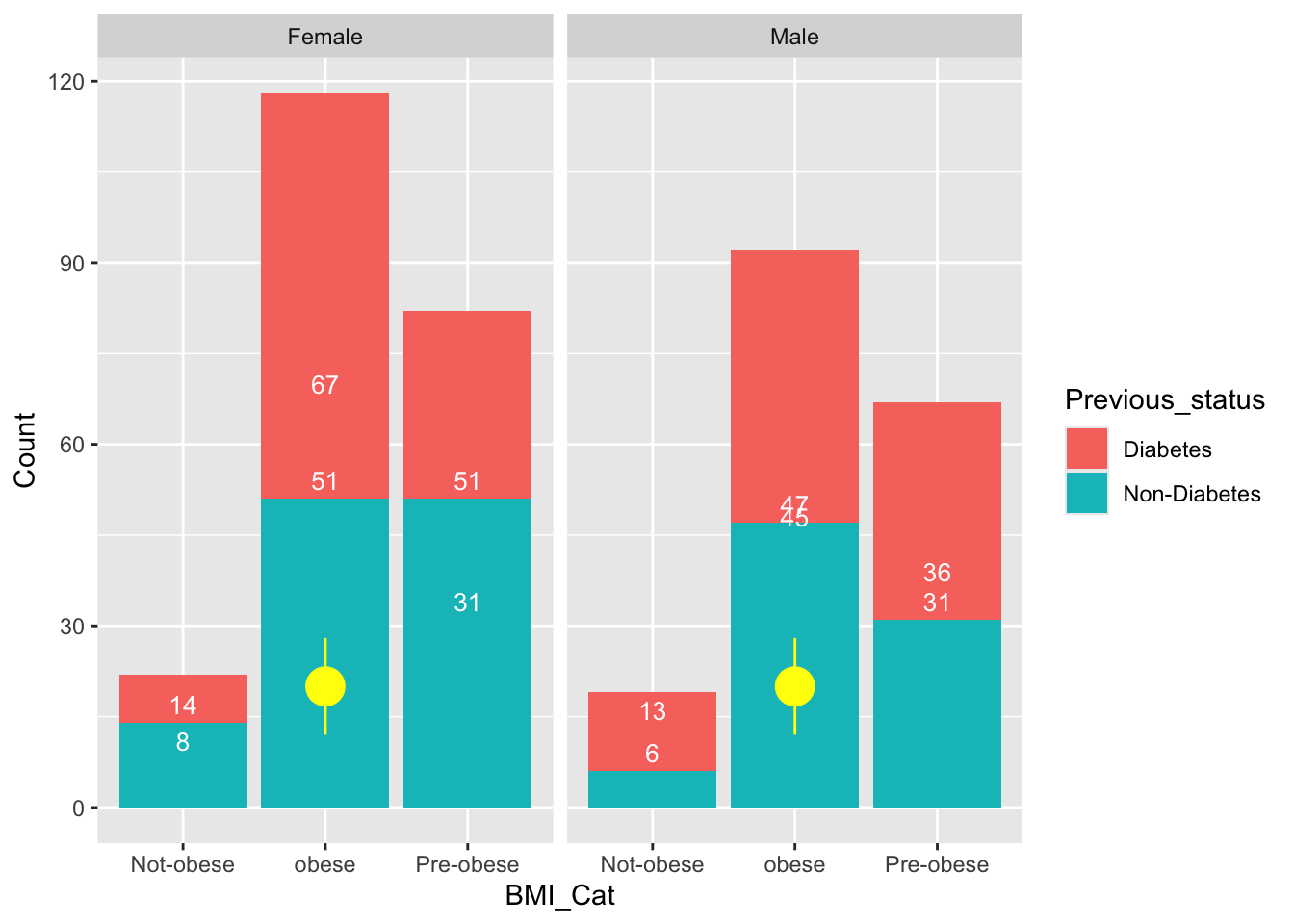
df %>% mutate(BMI_Cat=factor(case_when(BMI>30~"obese",
BMI<22~"Not-obese",
TRUE~"Pre-obese")))->df
str(df)'data.frame': 400 obs. of 7 variables:
$ Previous_status: Factor w/ 2 levels "Diabetes","Non-Diabetes": 1 1 1 1 1 1 1 1 1 1 ...
$ FBS : num 136 166 182 113 169 170 149 149 149 142 ...
$ BMI : num 22.2 32.3 28.6 24.8 35.3 33.2 43.7 23 27.9 31.4 ...
$ HbA1c : num 9.1 8.5 10.5 13.3 10.5 11.8 8.9 10.3 11.4 10.1 ...
$ Smoking : Factor w/ 2 levels "Non-Smoker","Smoker": 1 1 2 1 2 2 1 2 2 2 ...
$ Gender : Factor w/ 2 levels "Female","Male": 1 1 1 1 2 2 1 1 2 2 ...
$ BMI_Cat : Factor w/ 3 levels "Not-obese","obese",..: 3 2 3 3 2 2 2 3 3 2 ...summary(df) Previous_status FBS BMI HbA1c
Diabetes :200 Min. : 32.0 Min. : 9.10 Min. : 4.60
Non-Diabetes:200 1st Qu.:103.0 1st Qu.:25.75 1st Qu.: 6.10
Median :132.0 Median :30.70 Median : 7.00
Mean :130.1 Mean :30.78 Mean : 8.32
3rd Qu.:157.0 3rd Qu.:35.52 3rd Qu.:10.50
Max. :221.0 Max. :57.60 Max. :14.30
Smoking Gender BMI_Cat
Non-Smoker:272 Female:222 Not-obese: 41
Smoker :128 Male :178 obese :210
Pre-obese:149
head(df) Previous_status FBS BMI HbA1c Smoking Gender BMI_Cat
1 Diabetes 136 22.2 9.1 Non-Smoker Female Pre-obese
2 Diabetes 166 32.3 8.5 Non-Smoker Female obese
3 Diabetes 182 28.6 10.5 Smoker Female Pre-obese
4 Diabetes 113 24.8 13.3 Non-Smoker Female Pre-obese
5 Diabetes 169 35.3 10.5 Smoker Male obese
6 Diabetes 170 33.2 11.8 Smoker Male obeseglimpse(df)Rows: 400
Columns: 7
$ Previous_status <fct> Diabetes, Diabetes, Diabetes, Diabetes, Diabetes, Diab…
$ FBS <dbl> 136, 166, 182, 113, 169, 170, 149, 149, 149, 142, 150,…
$ BMI <dbl> 22.2, 32.3, 28.6, 24.8, 35.3, 33.2, 43.7, 23.0, 27.9, …
$ HbA1c <dbl> 9.1, 8.5, 10.5, 13.3, 10.5, 11.8, 8.9, 10.3, 11.4, 10.…
$ Smoking <fct> Non-Smoker, Non-Smoker, Smoker, Non-Smoker, Smoker, Sm…
$ Gender <fct> Female, Female, Female, Female, Male, Male, Female, Fe…
$ BMI_Cat <fct> Pre-obese, obese, Pre-obese, Pre-obese, obese, obese, …library(gtsummary)
df$Previous_status<-as.factor(df$Previous_status)
df %>% mutate_at(c(1,5,6,7),as.factor)->df
str(df)'data.frame': 400 obs. of 7 variables:
$ Previous_status: Factor w/ 2 levels "Diabetes","Non-Diabetes": 1 1 1 1 1 1 1 1 1 1 ...
$ FBS : num 136 166 182 113 169 170 149 149 149 142 ...
$ BMI : num 22.2 32.3 28.6 24.8 35.3 33.2 43.7 23 27.9 31.4 ...
$ HbA1c : num 9.1 8.5 10.5 13.3 10.5 11.8 8.9 10.3 11.4 10.1 ...
$ Smoking : Factor w/ 2 levels "Non-Smoker","Smoker": 1 1 2 1 2 2 1 2 2 2 ...
$ Gender : Factor w/ 2 levels "Female","Male": 1 1 1 1 2 2 1 1 2 2 ...
$ BMI_Cat : Factor w/ 3 levels "Not-obese","obese",..: 3 2 3 3 2 2 2 3 3 2 ...df %>%tbl_summary(by=Gender) %>% add_p() %>% bold_labels()| Characteristic | Female N = 2221 |
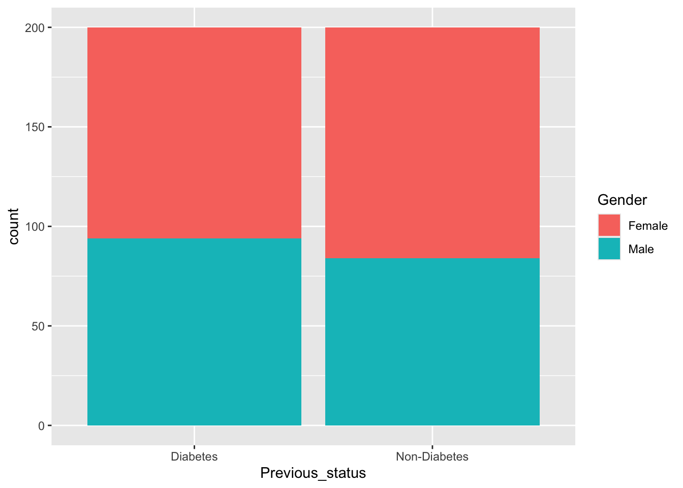
Male N = 1781 |
p-value2 |
|---|---|---|---|
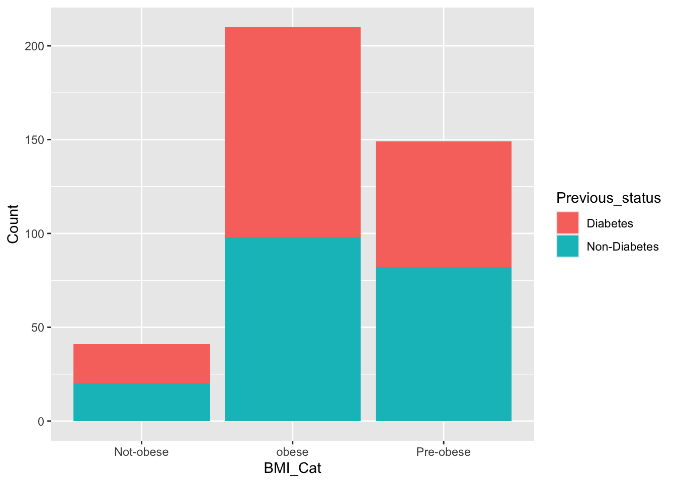
| Previous_status | 0.3 | ||
| Diabetes | 106 (48%) | 94 (53%) | |
| Non-Diabetes | 116 (52%) | 84 (47%) | |
| FBS | 130 (101, 154) | 137 (105, 160) | 0.2 |
| BMI | 31 (26, 36) | 31 (26, 35) | 0.7 |
| HbA1c | 6.80 (6.10, 10.50) | 8.60 (6.10, 10.50) | 0.5 |
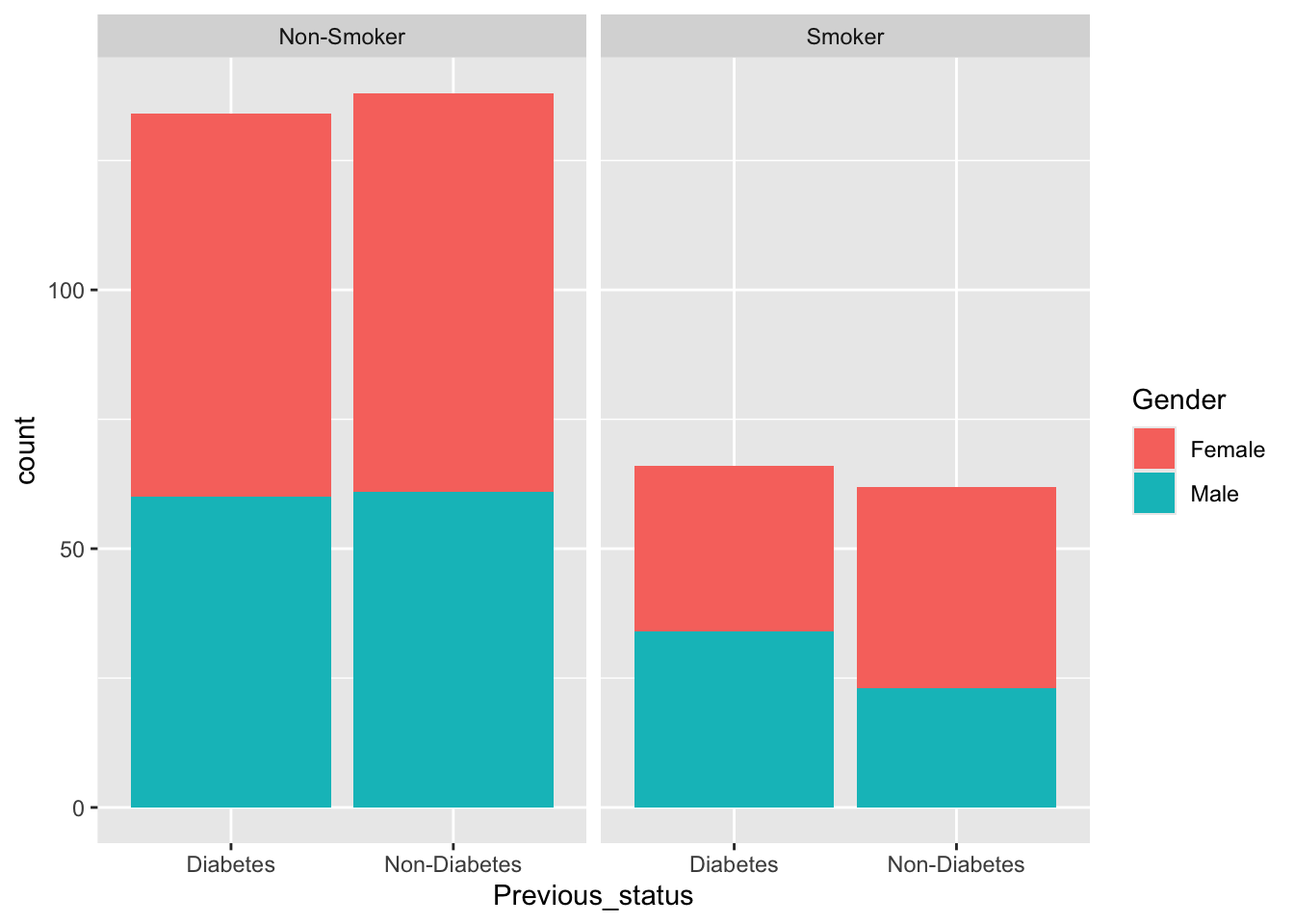
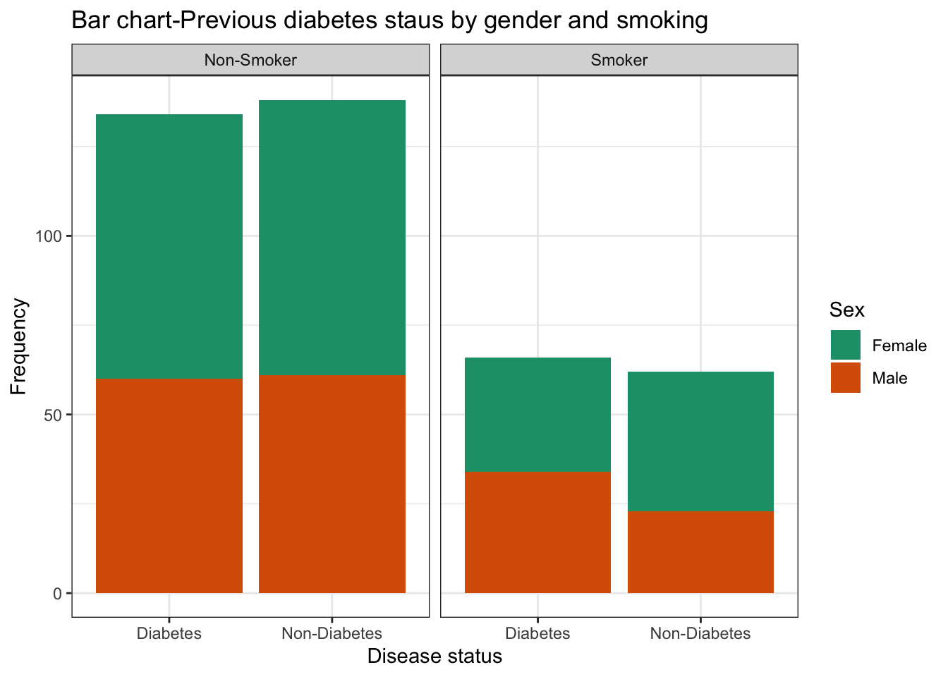
| Smoking | >0.9 | ||
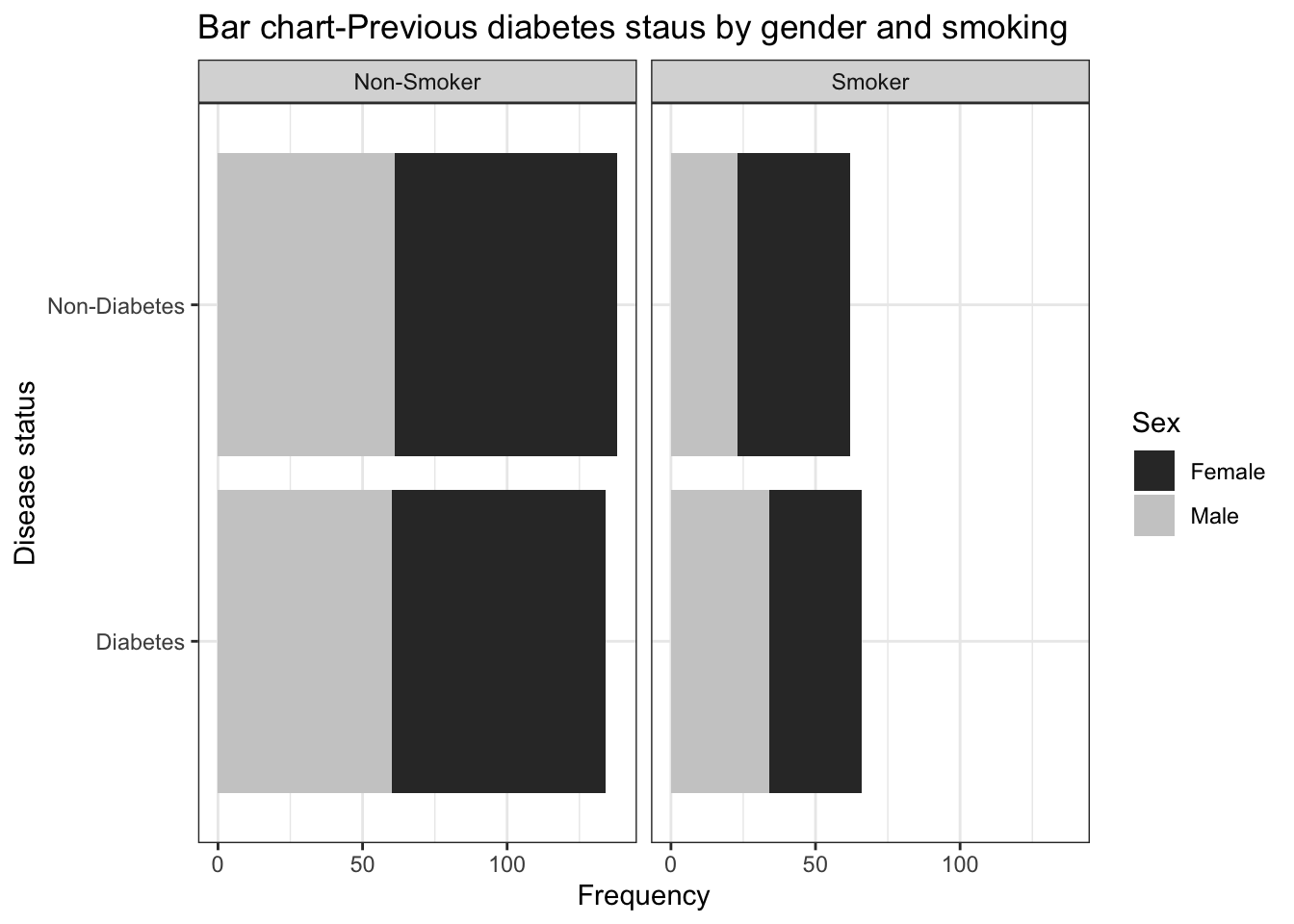
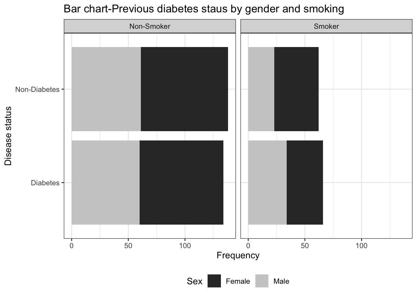
| Non-Smoker | 151 (68%) | 121 (68%) | |
| Smoker | 71 (32%) | 57 (32%) | |
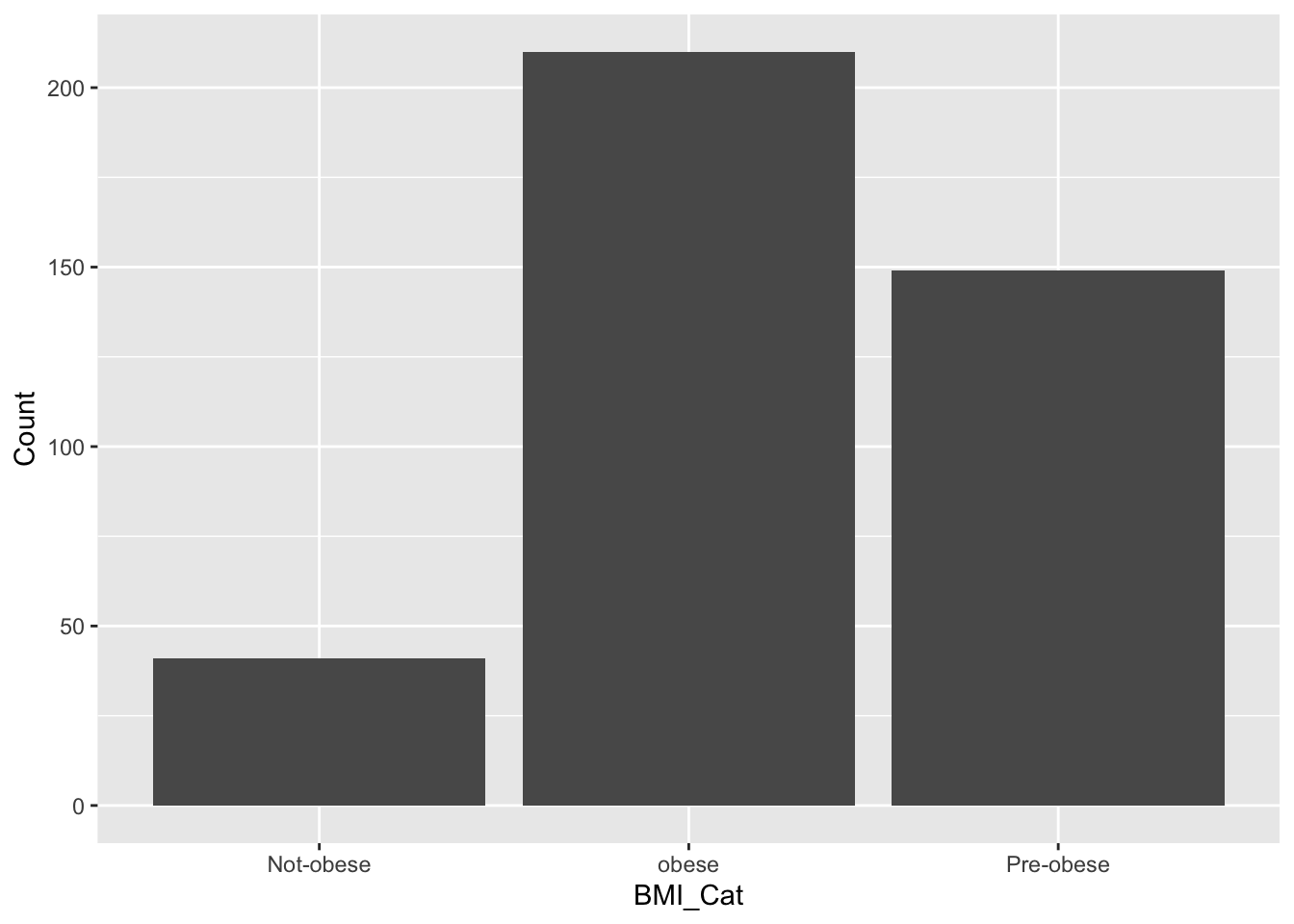
| BMI_Cat | >0.9 | ||
| Not-obese | 22 (9.9%) | 19 (11%) | |
| obese | 118 (53%) | 92 (52%) | |
| Pre-obese | 82 (37%) | 67 (38%) | |
| 1 n (%); Median (Q1, Q3) | |||
| 2 Pearson’s Chi-squared test; Wilcoxon rank sum test | |||
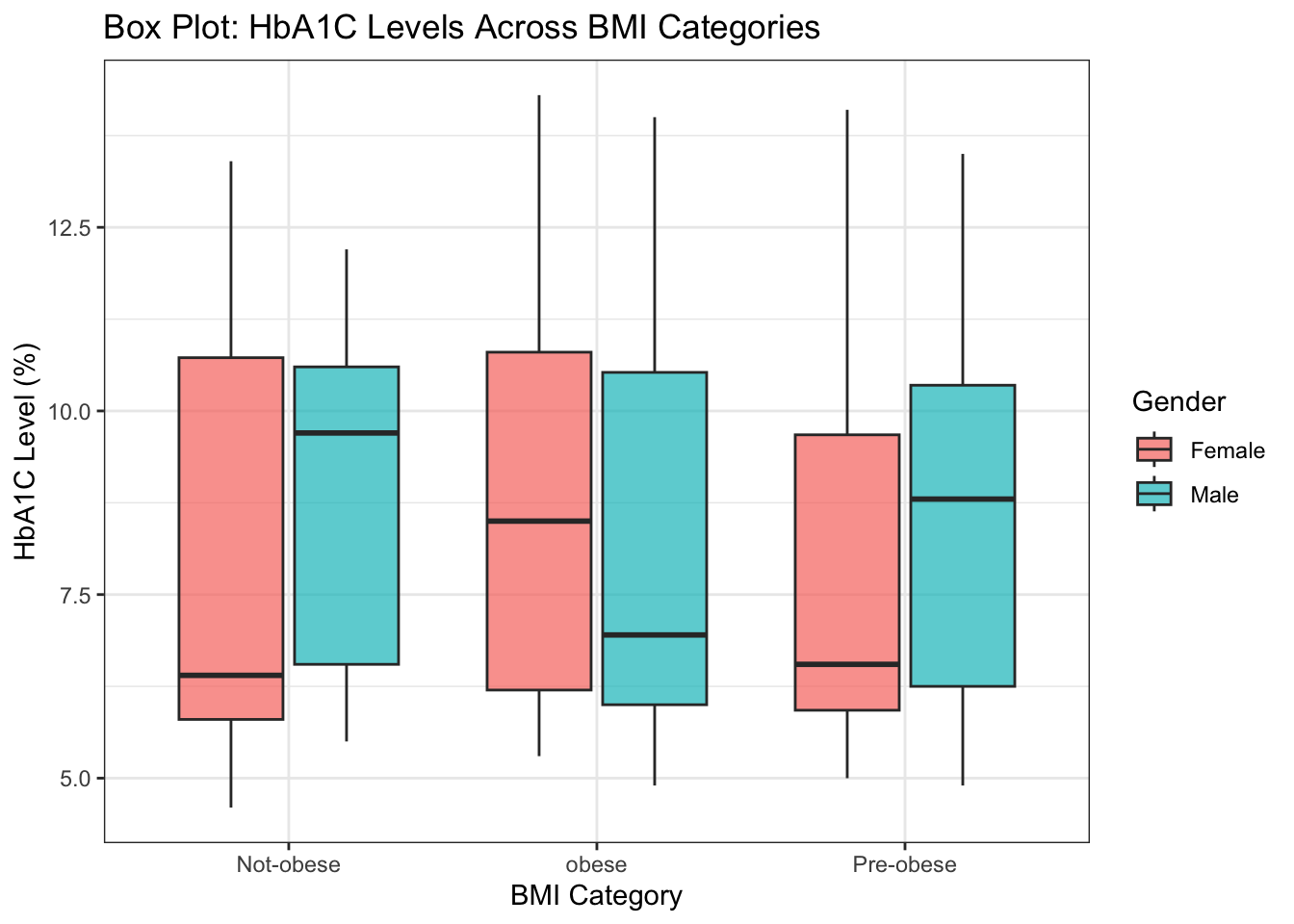
df %>% select(2:4,7) %>% tbl_summary(by=BMI_Cat,statistic = list(all_continuous() ~ "{mean} ({sd})") )%>%add_p() %>% add_ci()| Characteristic | Not-obese N = 411 |
95% CI | obese N = 2101 |
95% CI | Pre-obese N = 1491 |
95% CI | p-value2 |
|---|---|---|---|---|---|---|---|
| FBS | 131 (37) | 119, 143 | 132 (34) | 127, 137 | 127 (36) | 122, 133 | 0.5 |
| BMI | 18 (4) | 17, 19 | 36 (5) | 36, 37 | 26 (2) | 26, 27 | <0.001 |
| HbA1c | 8.33 (2.54) | 7.5, 9.1 | 8.49 (2.51) | 8.2, 8.8 | 8.08 (2.47) | 7.7, 8.5 | 0.2 |
| Abbreviation: CI = Confidence Interval | |||||||
| 1 Mean (SD) | |||||||
| 2 Kruskal-Wallis rank sum test | |||||||